DimBox is a lightweight, accessible and dependency free JavaScript library for displaying images, videos and other content on a web page. It is similar to the original Lightbox and dozens of others out there but does not require any additional libraries like jQuery to function. It also supports long captions in which many others fail miserably.
Installation
DimBox can be used by old school script linking or more modern way by installing via npm.
Old school manual installation
Download DimBox package from DimBox GitHub page. Unzip it to a desired location and link the minified css and js files from dist directory:
It is recommended to put the script element to the end of your HTML document body, although it can be put anywhere inside body or head.
Install with npm
Install DimBox with npm and then just import in in your js:
Remember to include styles as well, either old school by linking the stylesheet or using the DimBox SCSS which gives you the option to set your own values for some variables:Usage
After including the DimBox js file you can create DimBox links with data-dimbox attribute:
All links having the same value for data-dimbox will be shown in the same gallery. If you wish to have individual images only, you may leave data-dimbox attribute value empty or use unique value for each link.
Setting custom options
You can override default configuration by passing custom options to setConfig method:
See full list of available options.
Using with reactive frameworks like React or Vue
Although there are no official wrappers available, DimBox can be used with reactive frameworks such as React or Vue. Just make sure that DimBox is re-initialized on DOM changes, for example if new DimBox link elements are added to the DOM. This can be done simply by calling the method dimbox.init(), see methods for details.
Accessibility
Keyboard navigation
When DimBox is open it traps the focus inside DimBox elements only. This means that when navigating clickable elements via keyboard tab key, elements on the page under DimBox aren't focusable.
When DimBox is open the content can be browsed via keyboard with left and right arrow keys.
Video element aria-label
DimBox adds aria-label attribute automatically to video elements. If the link pointing to the video has aria-label set, it's value will be used for the video element. If the link doesn't have aria-label set but it has data-dimbox-caption, then it's value will be used for video element aria-label. If neither exist but the link contains an img element with alt attribute, the alt value will be used for vide element aria-label value.
IFrame element aria-label and title
The aria-label attribute is added to iframe elements with the same logic as on video elements. The same value is used also for the iframe element title attribute.
Options
Data attribute options
| Attribute | Notes |
|---|---|
data-dimbox |
All links having the same value for data-dimbox will be shown in the same gallery. If you wish to have individual images only, you may leave data-dimbox attribute value empty or use unique value for each link. |
data-dimbox-caption |
Caption text to be displayed below the content. |
data-dimbox-download-file |
Defines a file to download by clicking the download button. By default the download button downloads the image/video being displayed. With this attribute it can be overriden for example to download a high resolution version of the image or a any file for example when showing inline content. |
data-dimbox-ratio |
Iframe aspect ratio. Supported values are 16x9, 4x3, 1x1 and 9x16. Overrides config setting. |
data-dimbox-thumbnail |
Path to a custom thumbnail image. This will always override the default thumbnail. |
data-dimbox-type |
Type of the content. Valid values are image, video, iframe, inline and ajax. All other types except ajax can be detected automatically. |
Configuration options
| Name | Type | Default | Notes |
|---|---|---|---|
ajaxTemplate |
String | <div class="dimbox-ajax-container"><div class="dimbox-ajax-content">{{content}}</div><div class="dimbox-caption">{{caption}}</div></div> |
- |
closeOnOverlayClick |
Boolean | true |
- |
fullscreen |
Boolean | false |
If set to true DimBox opens in fullscreen mode. |
imageTemplate |
String | <figure class="dimbox-figure"><img src="{{src}}" class="dimbox-image" alt="{{alt}}" /><figcaption class="dimbox-caption">{{caption}}</figcaption></figure> |
- |
iframeRatio |
String | 16x9 |
Iframe aspect ratio. Supported values are 16x9, 4x3, 1x1 and 9x16. This setting can be overriden with data attribute data-dimbox-ratio. |
iframeTemplate |
String | <div class="dimbox-iframe-container"><iframe src="{{src}}" class="dimbox-iframe"></iframe><div class="dimbox-caption">{{caption}}</div></div> |
- |
inlineTemplate |
String | <div class="dimbox-inline-container"><div class="dimbox-inline-content">{{content}}</div><div class="dimbox-caption">{{caption}}</div></div> |
- |
onAfterClose |
Function | null |
- |
onAfterEnterFullscreen |
Function | null |
- |
onAfterExitFullscreen |
Function | null |
- |
onAfterInit |
Function | null |
- |
onAfterOpen |
Function | null |
- |
onAfterUpdateContent |
Function | null |
A reference to the current a element is passed to the function as an argument. |
onBeforeClose |
Function | null |
- |
onBeforeEnterFullscreen |
Function | null |
- |
onBeforeExitFullscreen |
Function | null |
- |
onBeforeInit |
Function | null |
- |
onBeforeOpen |
Function | null |
- |
onBeforeUpdateContent |
Function | null |
A reference to the current a element is passed to the function as an argument. |
onContentLoaded |
Function | null |
A reference to the current a element is passed to the function as an argument. |
onDownload |
Function | null |
- |
onXhrComplete |
Function | null |
- |
selector |
String | a[data-dimbox] |
- |
sequenceTemplate |
String | <span class="dimbox-sequence-current">{{current}}</span> / <span class="dimbox-sequence-total">{{total}}</span> |
- |
showDownloadButton |
Boolean | true |
Please note that if the image/video is in a different domain Access-Control-Allow-Origin header must be set to allow download. |
showFullscreenButton |
Boolean | true |
- |
showThumbnailsButton |
Boolean | false |
- |
svgCloseButton |
String | <svg xmlns="http://www.w3.org/2000/svg" width="16" height="16" fill="currentColor" viewBox="0 0 16 16"><path d="M2.146 2.854a.5.5 0 1 1 .708-.708L8 7.293l5.146-5.147a.5.5 0 0 1 .708.708L8.707 8l5.147 5.146a.5.5 0 0 1-.708.708L8 8.707l-5.146 5.147a.5.5 0 0 1-.708-.708L7.293 8 2.146 2.854Z"/></svg> |
- |
svgDownloadButton |
String | <svg xmlns="http://www.w3.org/2000/svg" width="16" height="16" fill="currentColor" viewBox="0 0 16 16"><path d="M.5 9.9a.5.5 0 0 1 .5.5v2.5a1 1 0 0 0 1 1h12a1 1 0 0 0 1-1v-2.5a.5.5 0 0 1 1 0v2.5a2 2 0 0 1-2 2H2a2 2 0 0 1-2-2v-2.5a.5.5 0 0 1 .5-.5z"/><path d="M7.646 11.854a.5.5 0 0 0 .708 0l3-3a.5.5 0 0 0-.708-.708L8.5 10.293V1.5a.5.5 0 0 0-1 0v8.793L5.354 8.146a.5.5 0 1 0-.708.708l3 3z"/></svg> |
- |
svgFullscreenButton |
String | <svg xmlns="http://www.w3.org/2000/svg" width="16" height="16" fill="currentColor" viewBox="0 0 16 16"><path d="M1.5 1a.5.5 0 0 0-.5.5v4a.5.5 0 0 1-1 0v-4A1.5 1.5 0 0 1 1.5 0h4a.5.5 0 0 1 0 1zM10 .5a.5.5 0 0 1 .5-.5h4A1.5 1.5 0 0 1 16 1.5v4a.5.5 0 0 1-1 0v-4a.5.5 0 0 0-.5-.5h-4a.5.5 0 0 1-.5-.5M.5 10a.5.5 0 0 1 .5.5v4a.5.5 0 0 0 .5.5h4a.5.5 0 0 1 0 1h-4A1.5 1.5 0 0 1 0 14.5v-4a.5.5 0 0 1 .5-.5m15 0a.5.5 0 0 1 .5.5v4a1.5 1.5 0 0 1-1.5 1.5h-4a.5.5 0 0 1 0-1h4a.5.5 0 0 0 .5-.5v-4a.5.5 0 0 1 .5-.5"/></svg> |
- |
svgFullscreenExitButton |
String | <svg xmlns="http://www.w3.org/2000/svg" width="16" height="16" fill="currentColor" viewBox="0 0 16 16"><path d="M5.5 0a.5.5 0 0 1 .5.5v4A1.5 1.5 0 0 1 4.5 6h-4a.5.5 0 0 1 0-1h4a.5.5 0 0 0 .5-.5v-4a.5.5 0 0 1 .5-.5m5 0a.5.5 0 0 1 .5.5v4a.5.5 0 0 0 .5.5h4a.5.5 0 0 1 0 1h-4A1.5 1.5 0 0 1 10 4.5v-4a.5.5 0 0 1 .5-.5M0 10.5a.5.5 0 0 1 .5-.5h4A1.5 1.5 0 0 1 6 11.5v4a.5.5 0 0 1-1 0v-4a.5.5 0 0 0-.5-.5h-4a.5.5 0 0 1-.5-.5m10 1a1.5 1.5 0 0 1 1.5-1.5h4a.5.5 0 0 1 0 1h-4a.5.5 0 0 0-.5.5v4a.5.5 0 0 1-1 0z"/></svg> |
- |
svgImageIcon |
String | <svg xmlns="http://www.w3.org/2000/svg" width="16" height="16" fill="currentColor" class="bi bi-image" viewBox="0 0 16 16"><path d="M6.002 5.5a1.5 1.5 0 1 1-3 0 1.5 1.5 0 0 1 3 0"/><path d="M2.002 1a2 2 0 0 0-2 2v10a2 2 0 0 0 2 2h12a2 2 0 0 0 2-2V3a2 2 0 0 0-2-2zm12 1a1 1 0 0 1 1 1v6.5l-3.777-1.947a.5.5 0 0 0-.577.093l-3.71 3.71-2.66-1.772a.5.5 0 0 0-.63.062L1.002 12V3a1 1 0 0 1 1-1z"/></svg> |
This is the image icon used in thumbnails for image type content if no thumbnail image could be loaded. |
svgPrevNextButton |
String | <svg xmlns="http://www.w3.org/2000/svg" width="16" height="16" fill="currentColor" viewBox="0 0 16 16"><path fill-rule="evenodd" d="M4.646 1.646a.5.5 0 0 1 .708 0l6 6a.5.5 0 0 1 0 .708l-6 6a.5.5 0 0 1-.708-.708L10.293 8 4.646 2.354a.5.5 0 0 1 0-.708z"/></svg> |
This is the next button image (chevron right) which is used also for the previous button but flipped horizontally. |
svgThumbnailsOffButton |
String | <svg xmlns="http://www.w3.org/2000/svg" width="16" height="16" fill="currentColor" viewBox="0 0 16 16"><path d="M6.58,3.94c0,.72-.59,1.31-1.31,1.31s-1.31-.59-1.31-1.31.59-1.31,1.31-1.31,1.31.59,1.31,1.31"/><path d="M2.75,0c-.97,0-1.75.78-1.75,1.75v8.75c0,.97.78,1.75,1.75,1.75h10.5c.97,0,1.75-.78,1.75-1.75V1.75c0-.97-.78-1.75-1.75-1.75H2.75ZM13.25.88c.48,0,.88.39.88.88v5.69l-3.3-1.7c-.17-.08-.37-.05-.5.08l-3.25,3.25-2.33-1.55c-.17-.12-.4-.09-.55.05l-2.32,2.06V1.75c0-.48.39-.88.87-.88h10.5Z"/><path d="M1.07,13.07c.09-.09.22-.09.3,0h0l1.13,1.13,1.13-1.13c.09-.09.22-.09.3,0,.07.09.09.22,0,.3l-1.13,1.13,1.13,1.13c.09.09.09.22,0,.3s-.22.09-.3,0l-1.13-1.13-1.13,1.13c-.09.09-.22.09-.3,0s-.09-.22,0-.3l1.13-1.13-1.13-1.13c-.09-.09-.09-.22,0-.3h0"/><path d="M4.73,13.07c.09-.09.22-.09.3,0h0l1.13,1.13,1.13-1.13c.09-.09.22-.09.3,0,.07.09.09.22,0,.3l-1.13,1.13,1.13,1.13c.09.09.09.22,0,.3s-.22.09-.3,0l-1.13-1.13-1.13,1.13c-.09.09-.22.09-.3,0s-.09-.22,0-.3l1.13-1.13-1.13-1.13c-.09-.09-.09-.22,0-.3h0"/><path d="M8.4,13.07c.09-.09.22-.09.3,0h0l1.13,1.13,1.13-1.13c.09-.09.22-.09.3,0,.07.09.09.22,0,.3l-1.13,1.13,1.13,1.13c.09.09.09.22,0,.3s-.22.09-.3,0l-1.13-1.13-1.13,1.13c-.09.09-.22.09-.3,0s-.09-.22,0-.3l1.13-1.13-1.13-1.13c-.09-.09-.09-.22,0-.3h0"/><path d="M12.07,13.07c.09-.09.22-.09.3,0h0l1.13,1.13,1.13-1.13c.09-.09.22-.09.3,0,.07.09.09.22,0,.3l-1.13,1.13,1.13,1.13c.09.09.09.22,0,.3s-.22.09-.3,0l-1.13-1.13-1.13,1.13c-.09.09-.22.09-.3,0s-.09-.22,0-.3l1.13-1.13-1.13-1.13c-.09-.09-.09-.22,0-.3h0"/></svg> |
- |
svgThumbnailsOnButton |
String | <svg xmlns="http://www.w3.org/2000/svg" width="16" height="16" fill="currentColor" viewBox="0 0 16 16"><path d="M3.25,13h-1.5c-.41,0-.75.34-.75.75v1.5c0,.41.34.75.75.75h1.5c.41,0,.75-.34.75-.75v-1.5c0-.41-.34-.75-.75-.75ZM3.25,15.25h-1.5v-1.5h1.5v1.5Z"/><path d="M6.92,13h-1.5c-.41,0-.75.34-.75.75v1.5c0,.41.34.75.75.75h1.5c.41,0,.75-.34.75-.75v-1.5c0-.41-.34-.75-.75-.75ZM6.92,15.25h-1.5v-1.5h1.5v1.5Z"/><path d="M10.58,13h-1.5c-.41,0-.75.34-.75.75v1.5c0,.41.34.75.75.75h1.5c.41,0,.75-.34.75-.75v-1.5c0-.41-.34-.75-.75-.75ZM10.58,15.25h-1.5v-1.5h1.5v1.5Z"/><path d="M14.25,13h-1.5c-.41,0-.75.34-.75.75v1.5c0,.41.34.75.75.75h1.5c.41,0,.75-.34.75-.75v-1.5c0-.41-.34-.75-.75-.75ZM14.25,15.25h-1.5v-1.5h1.5v1.5Z"/><path d="M6.58,3.94c0,.72-.59,1.31-1.31,1.31s-1.31-.59-1.31-1.31.59-1.31,1.31-1.31,1.31.59,1.31,1.31"/><path d="M2.75,0c-.97,0-1.75.78-1.75,1.75v8.75c0,.97.78,1.75,1.75,1.75h10.5c.97,0,1.75-.78,1.75-1.75V1.75c0-.97-.78-1.75-1.75-1.75H2.75ZM13.25.88c.48,0,.88.39.88.88v5.69l-3.3-1.7c-.17-.08-.37-.05-.5.08l-3.25,3.25-2.33-1.55c-.17-.12-.4-.09-.55.05l-2.32,2.06V1.75c0-.48.39-.88.87-.88h10.5Z"/></svg> |
- |
svgVideoIcon |
String | <svg xmlns="http://www.w3.org/2000/svg" width="16" height="16" fill="currentColor" class="bi bi-play-fill" viewBox="0 0 16 16"><path d="m11.596 8.697-6.363 3.692c-.54.313-1.233-.066-1.233-.697V4.308c0-.63.692-1.01 1.233-.696l6.363 3.692a.802.802 0 0 1 0 1.393"/></svg> |
This is the video icon used in thumbnails for video type content if no thumbnail image could be loaded. |
theme |
String | 'dark' |
Built in themes are 'dark' and 'light'. |
thumbnails |
Boolean | false |
When set to true gallery thumbnail images are shown below the image when DimBox is open. This requires the gallery to have more than one item. By default the image used as link will be shown as a thumbnail. If the link element doesn't contain an image a generic placeholder will be used. |
thumbnailsInitState |
Boolean | true |
If thumbnails are enabled are they shown initially or not. This of course makes sense only with the use of showThumbnailsButton. |
videoAutoplay |
Boolean | true |
- |
videoControls |
Boolean | true |
- |
videoLoop |
Boolean | false |
- |
videoTemplate |
String | <div class="dimbox-video-container"><video src="{{src}}" class="dimbox-video"></video><div class="dimbox-caption">{{caption}}</div></div> |
- |
videoVolume |
Number | null |
Video initial volume level 0-1. For example value 0.5 equals to 50% volume. |
xhrResponseType |
String | 'json' |
- |
Methods
DimBox can also be controlled programmatically without user interaction via public methods:
| Method | Example | Notes |
|---|---|---|
close() |
|
Closes DimBox. |
init() |
|
Re-initializes DimBox. This can be used for example when the DOM has changed after DimBox load. |
next() |
|
Changes to next item if available. |
open(el) |
|
Opens DimBox as it would by clicking the a element. |
previous() |
|
Changes to previous item if available. |
setConfig(options) |
|
Overrides default config with given options. |
Events
You can define callback functions for DimBox events with event hooks in setConfig options:
Demo
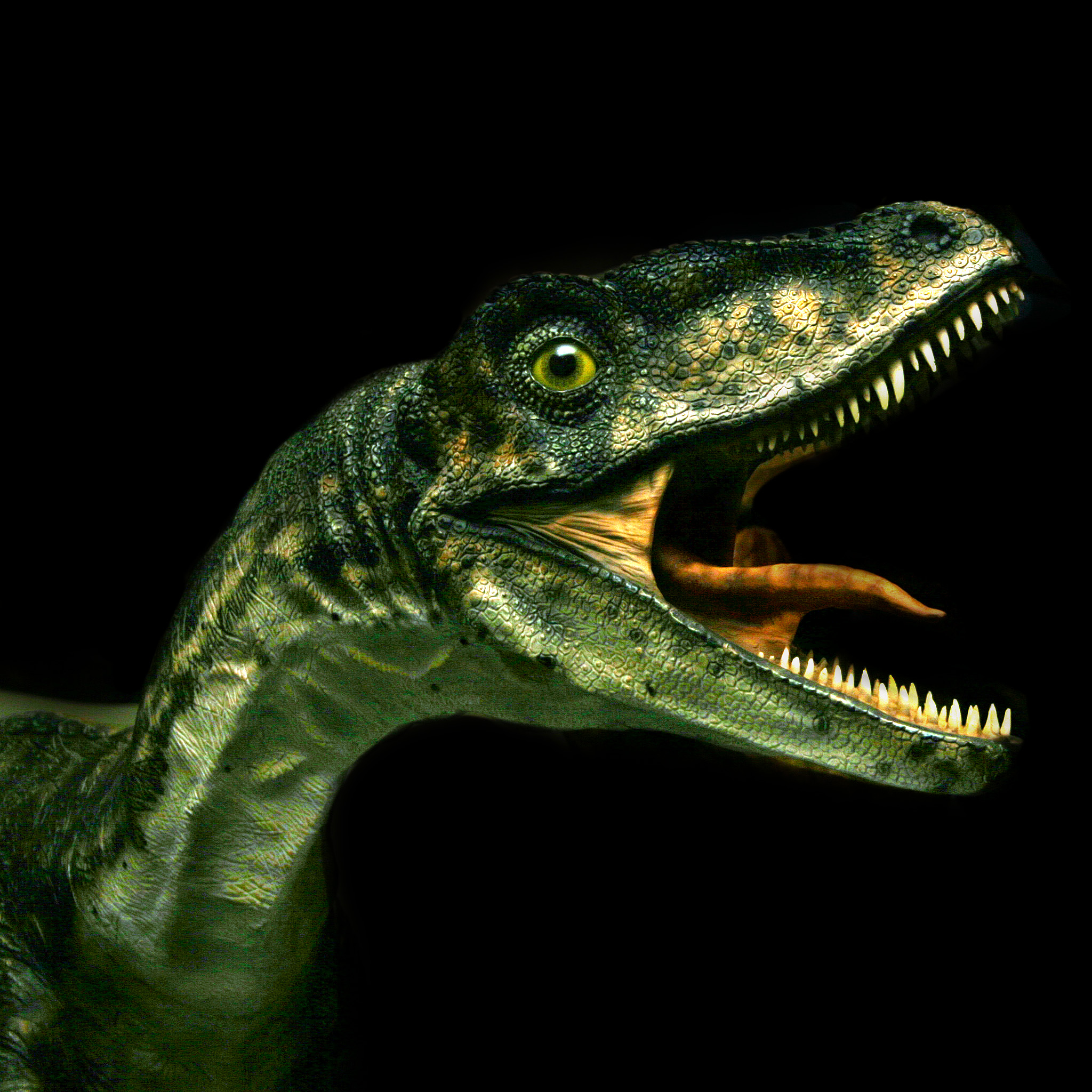
Single image
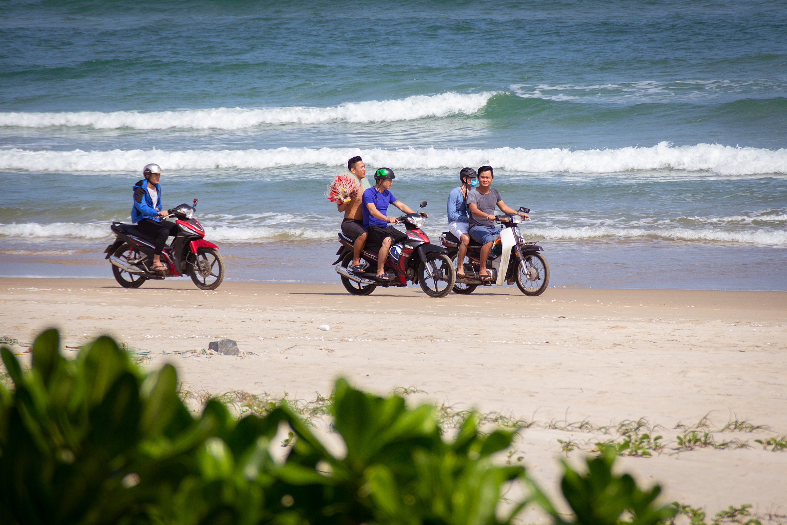
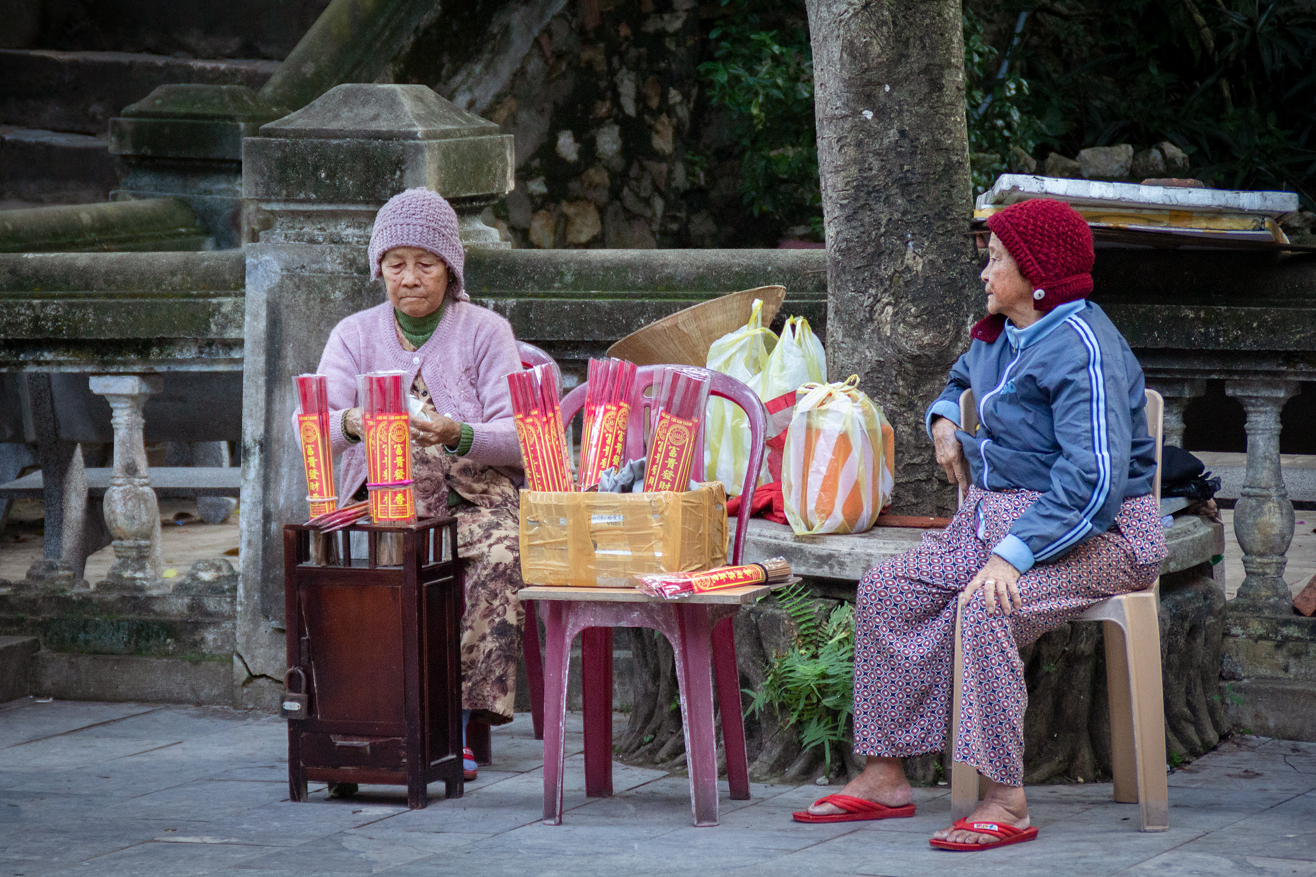
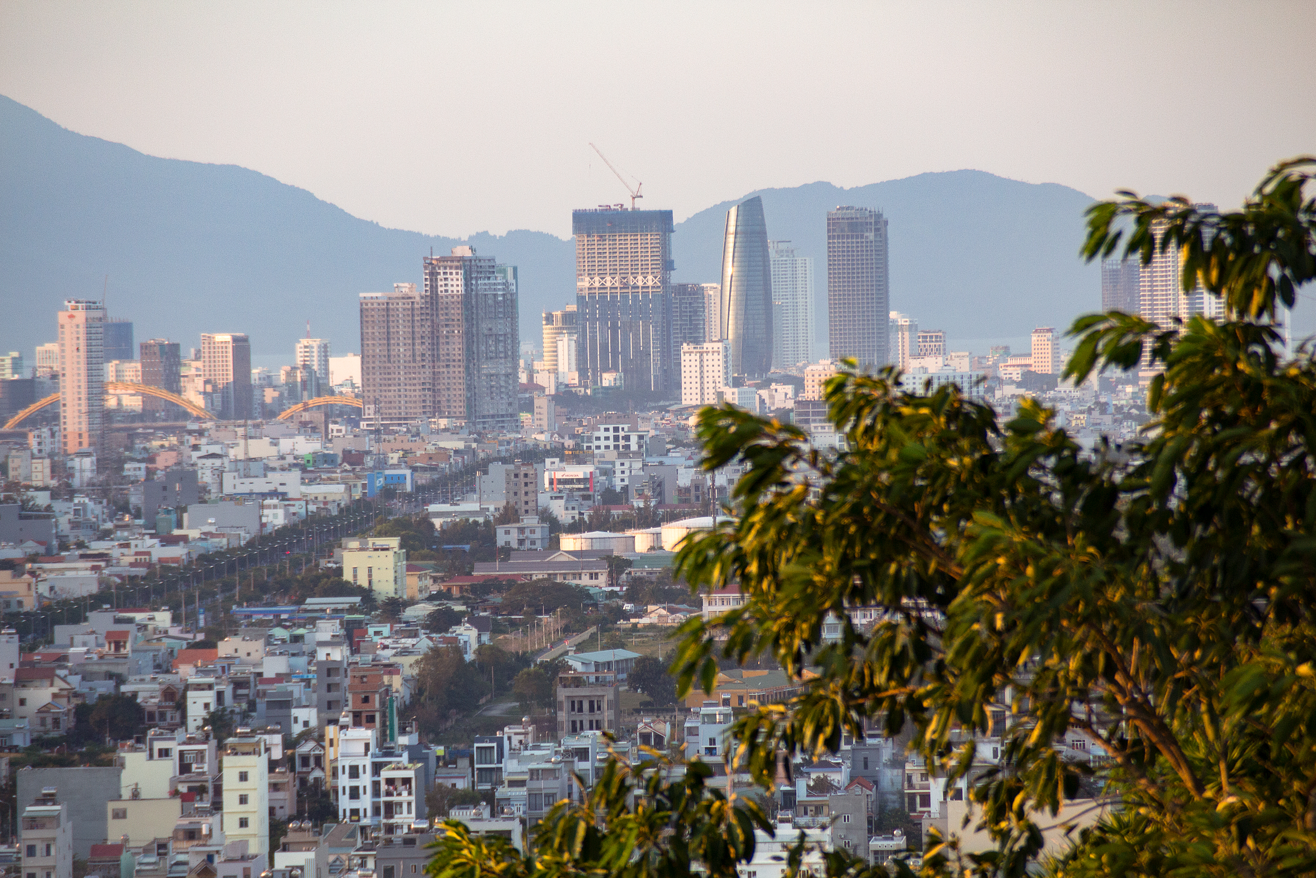
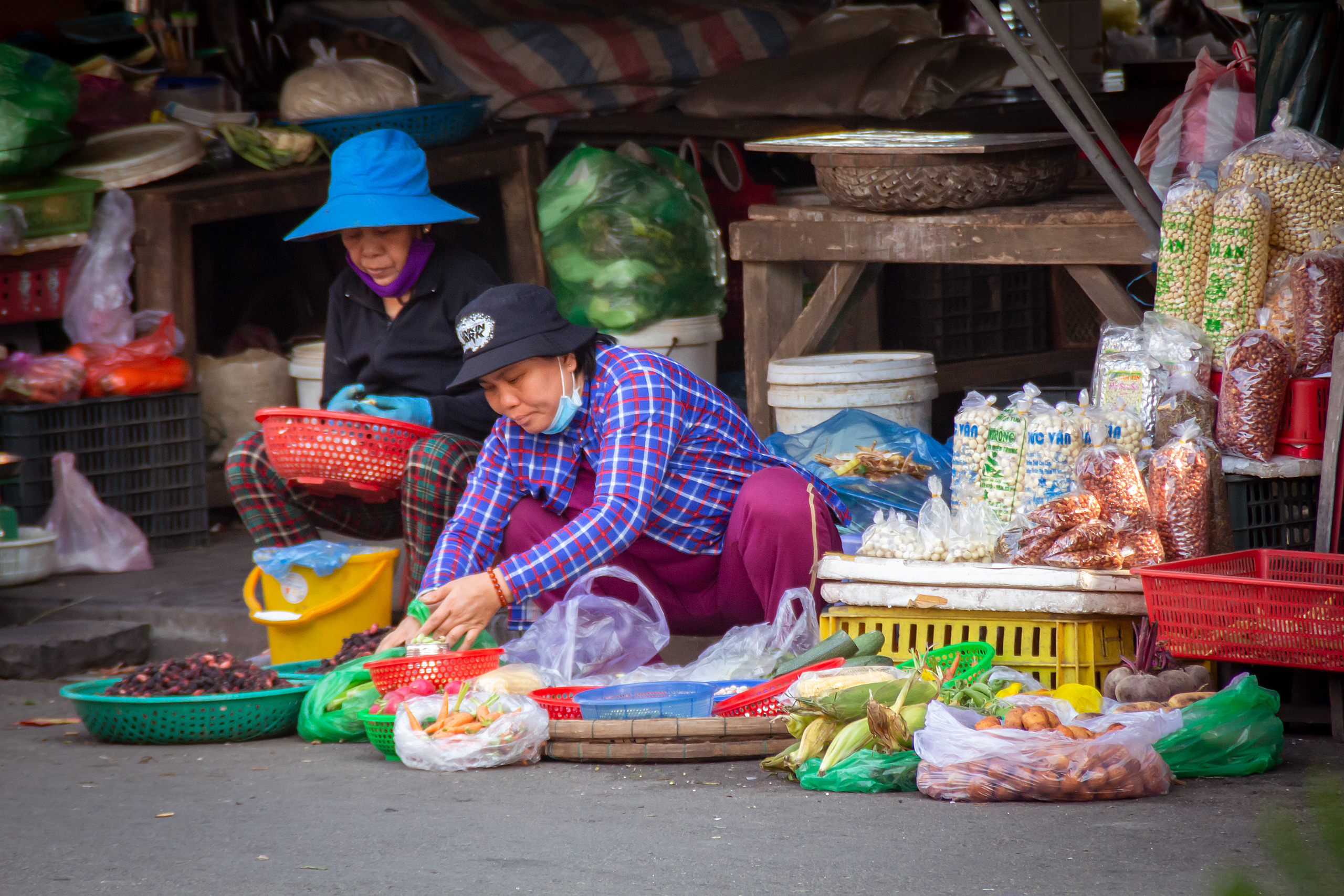
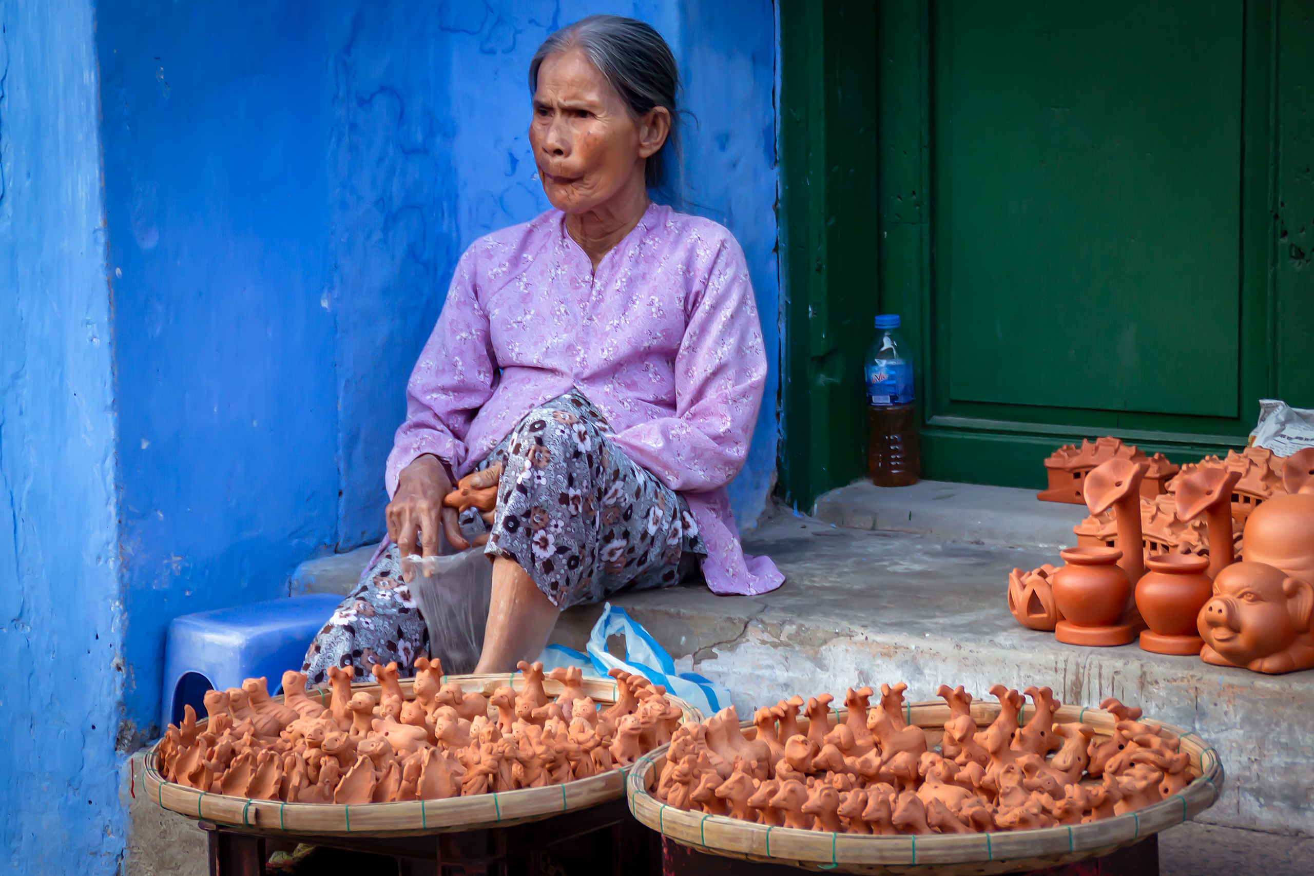
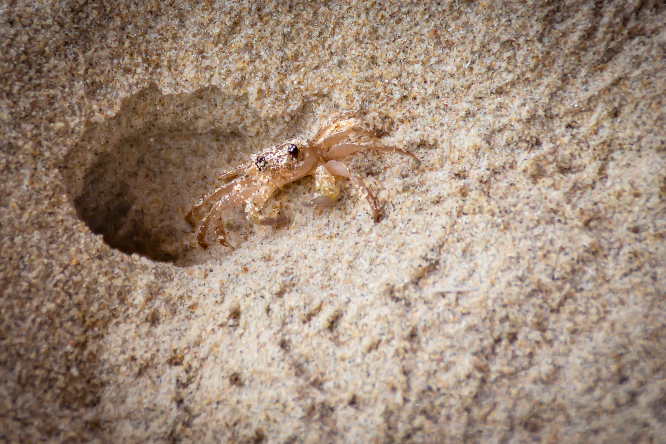
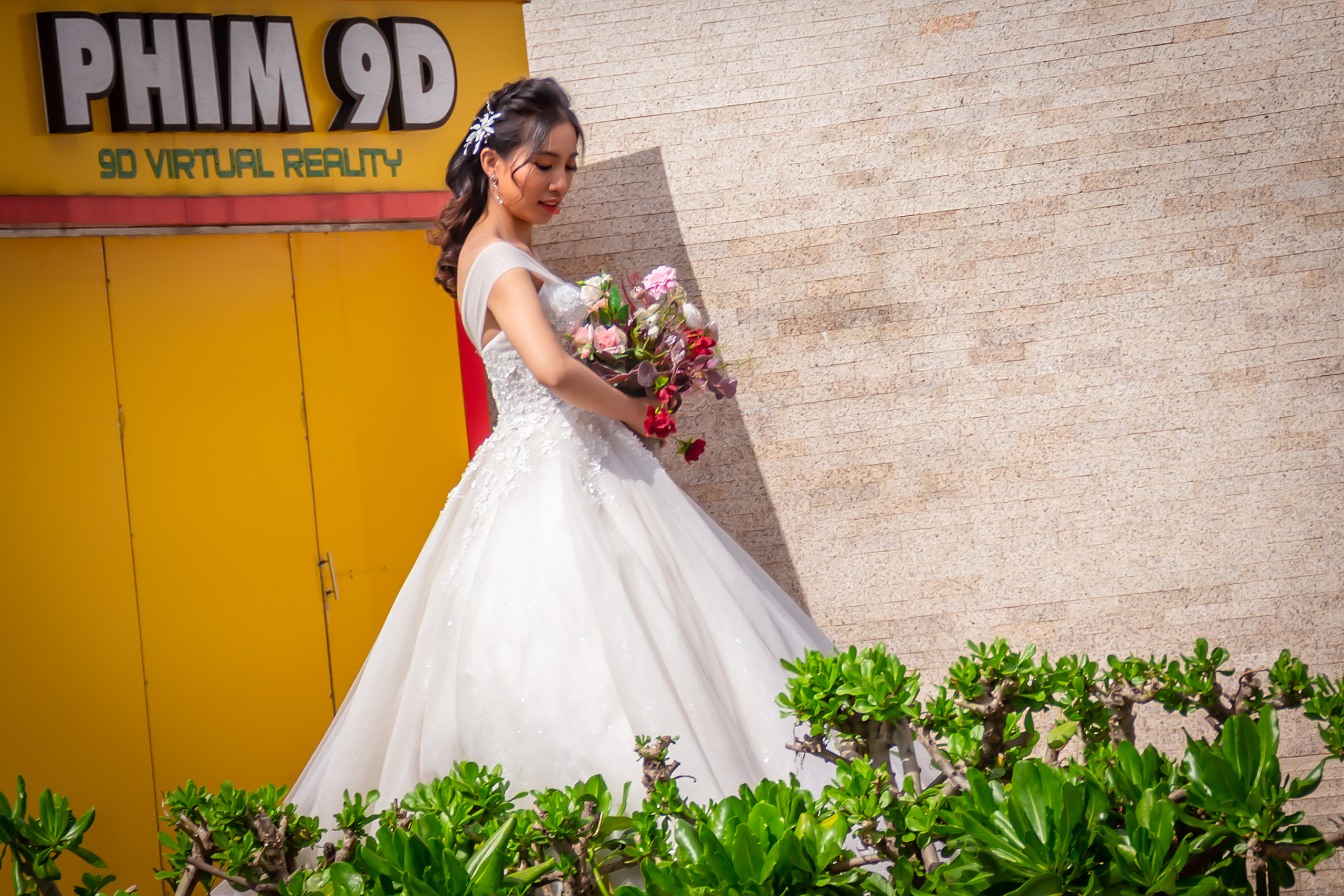
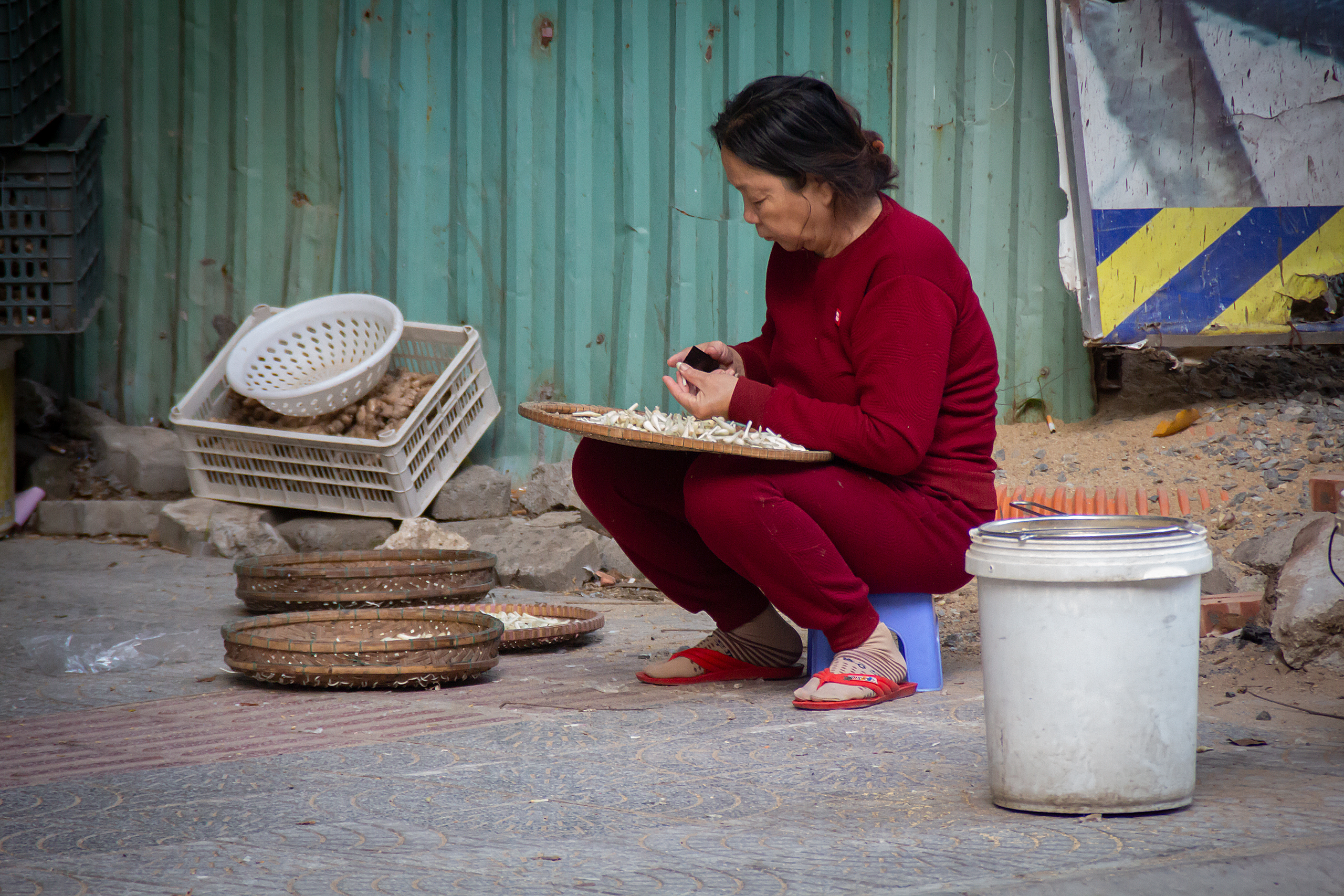
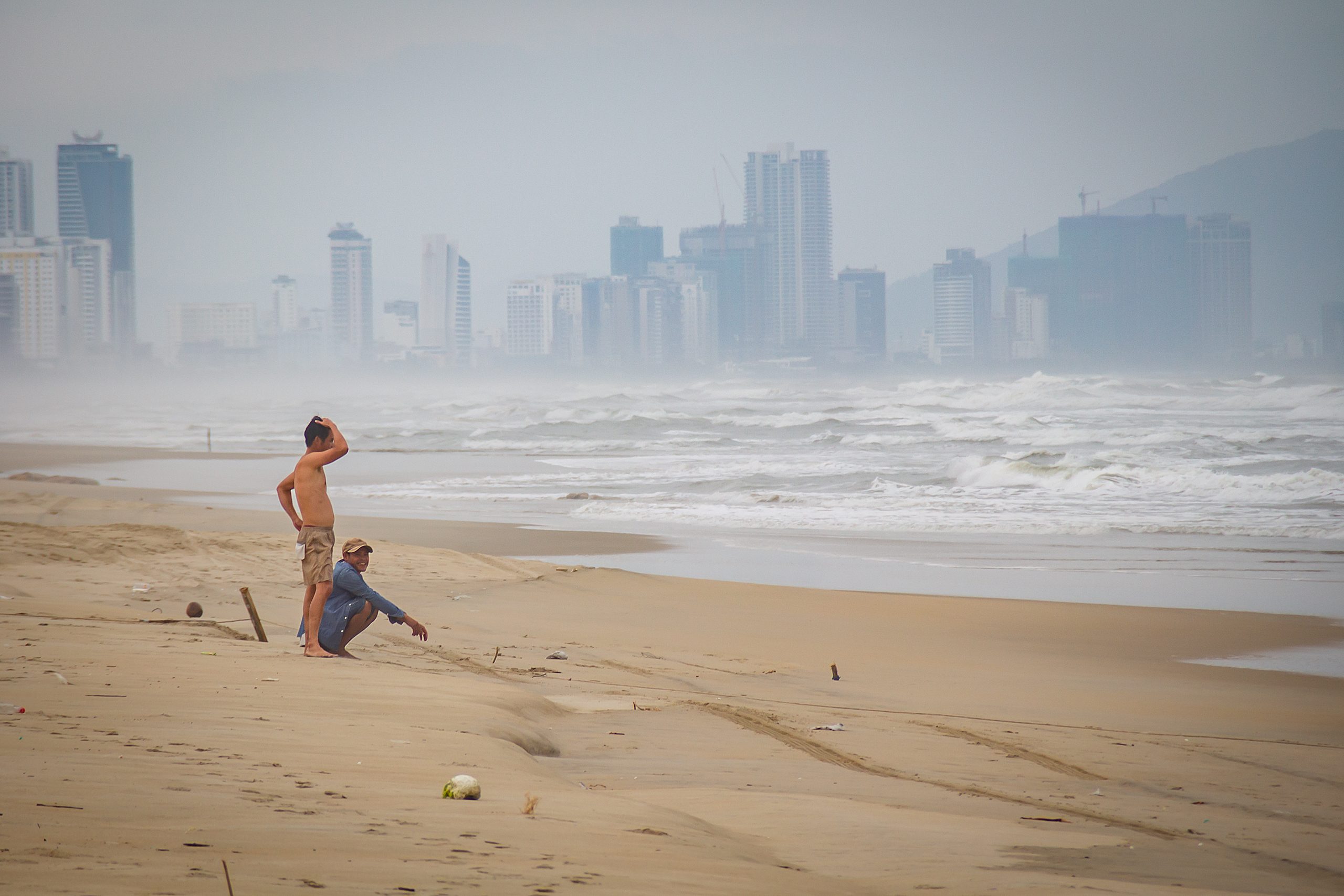
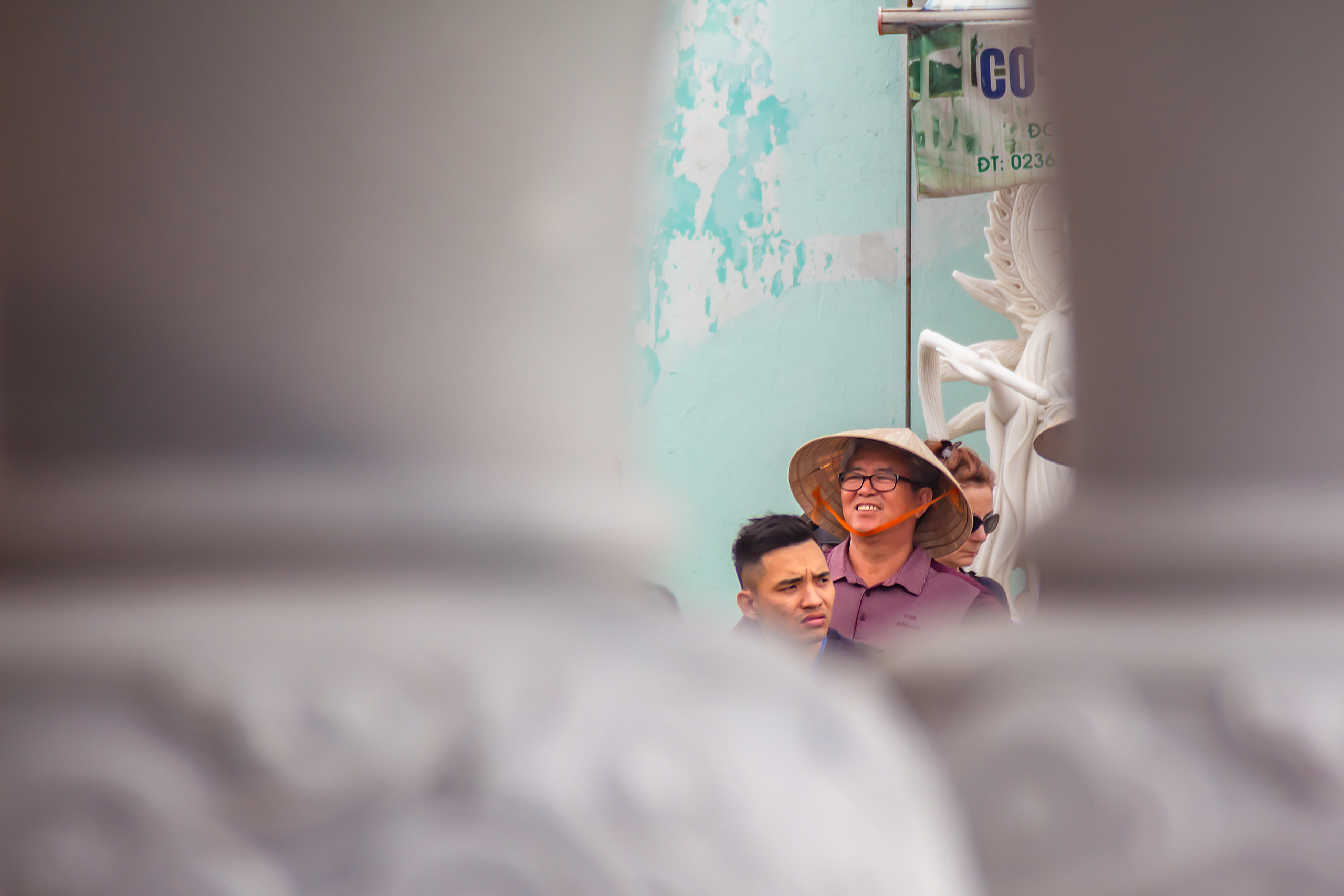
Gallery: Vietnam


Gallery: Mixed content types
Misc examples
Type: iframe Type: inline Type: ajax Type: ajax (fail to load content) YouTube embed Vimeo embed Image with a really long caption Huge image without cache
Donate
DimBox is 100% free to use but I won't blame you for making donations to get me my daily dose of caffeine!
Inline content
This content is hidden on the page html and opened in DimBox. Lorem ipsum dolor sit amet consectetur adipisicing elit. Unde numquam consequuntur, laudantium in suscipit laboriosam ab, quae velit officiis optio explicabo quos repellendus ullam eum ducimus molestias iure modi totam?